6.1 Your options, with examples
Overview Introduction Options, with examples Results and next steps
Tips on reporting results
Decision makers and funders of monitoring programs
First, we acknowledge that decision makers are extremely busy and that they prefer one or two-page summaries of complex studies along with their implications. However, we encourage decision makers to ask questions of their scientific advisors to learn more about relevant assumptions or complexities that might affect interpretation of data. While scientists strive to simplify results and recommendations, some results are complex and cannot be summarized in just a few pages. Second, although multi-layered maps are a common way to present information about ecological systems, they too should not be relied on solely. Often there are details that are critical to decisions that cannot be represented in maps.
Scientists and technical staff
The following set of suggestions is mostly directed toward scientists and technical staff who are presenting results to decision makers and non-technical readers.
- We emphasize here that results of monitoring programs need to be clearly communicated and thoroughly documented. If confusion arises when readers interpret the reported results, effective evaluation and proper decisions will be impeded.
- Failure to communicate clearly will undermine the benefits of carefully going through the other steps in the 7-step monitoring wheel.
- Many
well-meaning scientists often inadvertently produce material that is
difficult to understand, especially by non-technically trained readers.
The age-old adage of "keep it simple" applies here.
- All information should be tailored to the needs of the audience. Technical terms and jargon should be minimized unless the material is for a technical audience.
- If results are complex or voluminous, and if time and budget allow, it would be ideal to present results in a hierarchical information system such as a web site with multiple hypertext links to different sections. Summary information in the form of simple statements and graphs can appear at the top level in this information system, and multiple levels of hypertext links can take users in successive steps to more detailed data broken down as finely as required. This system can allow readers to dip into the information in steps to the extent necessary for their level of understanding of salmon populations, ecology, statistics, and management issues. As readers learn more, they can go to pages with more detail.
- Different people understand complex data via different formats and styles of presentations. Some can work through tables of data more easily than complex graphs. Others prefer the latter. However, all else being equal, graphs are preferable. A hierarchical information system, as described above, would be ideal for showing multiple forms of presentation, but it requires extra time and effort.
- Past research and experience by communication specialists has led to several conclusions about what formats of graphs to avoid.
See Tufte (1983, 1990, 2006) for informative examples, and especially
Cleveland (1994), which is the most appropriate book on this topic for
the field. These books also show preferred formats for many types of
information. Here are a few conclusions from these books.
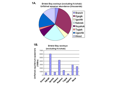
- 1. Avoid pie charts, circle plots, and other representations of data in which the scale of one item is not
easily compared with that of other items Cleveland (1994, pp. 262-269). For
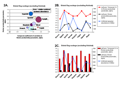
instance, the sizes of slices of pie charts are notoriously difficult to quantitatively estimate and compare, partly because of the nonlinear linkage between angle and area of each slice (Figure 1A). Instead, use a more direct bar plot or line plot, which will show the differences among categories much more clearly (Figure 1B). For similar reasons, diameters or areas of individual circles are hard to compare with others in circle
plots. In circle plots, the diameter of each circle represents some attribute
such as relative abundance of a population. Again, a standard bar diagram or line plot will make comparisons
across categories easier and less subject to visual distortion. For example, compare Figure 2A with Figures 2B and 2C below. Click on images to enlarge them. Data in Figures 1 and 2 are from Dorner et al. (2008).
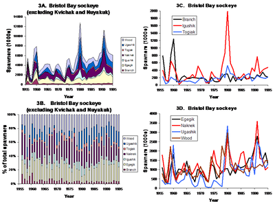
- 2. Avoid any type of stacked diagram or "divided bar chart", such as a stacked line plot (Figure 3A below) or stacked bar plot (Figure 3B) in which the values of two or more variables are stacked on top of one another to accumulate to some total (Cleveland 1994, pp. 262-269). The reason for the poor desirability of these types of graphs is that only the bottom-most variable can be readily interpreted. The magnitude of the other variables cannot be readily decoded visually because their bases start at different levels, that is, on the tops of the first variable on which they are stacked. Instead, use standard line plots with a set of lines (one for each variable) or separate bars (again, one for each variable). For example, compare Figures 3A and 3B below (examples of stacked plots). Each one of those figures could be replaced by equivalent line plots (Figures 3C-3D). The latter more clearly indicate the relative magnitudes of spawner abundances among populations in a given year. The Y-axis scale in Figures 3C and 3D could also be made identical to facilitate that comparison. Data in Figure 3 are from Dorner et al. (2008).
-
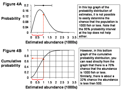
3. Probability distributions or frequency distributions are good for describing uncertainty or probability (~confidence) intervals around some estimate. However, if you are attempting to convey the chance (i.e., probability) that some variable on an X axis is less than (or greater than) some value, then probability or frequency distributions should be avoided in favor of using a cumulative probability distribution (also known as a CDF, or cumulative distribution function) like Figure 4B. An accompanying simple description of how to interpret such cumulative probability distributions, along with some examples, is usually sufficient for people to understand them. For example, compare a probability distribution (Figure 4A) and a cumulative probability distribution (Figure 4B) below.
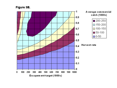
- 4. Some people cannot readily understand contour plots, or isopleth diagrams, of 3-dimensional data, like Figure 5B.
Although many of us have experience reading contour maps for hiking in
the wilderness, this type of presentation can be surprisingly confusing to some
people. If a contour plot is warranted, it should be accompanied by at least one of two
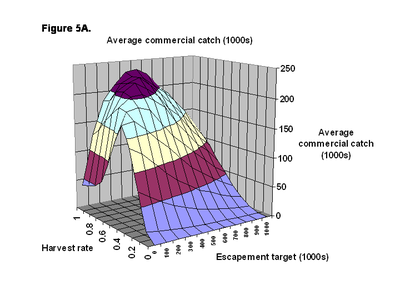
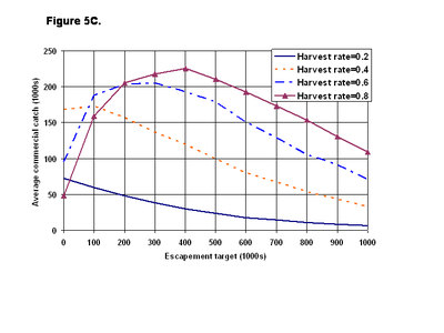
other types of figures: (1) a 3-dimensional perspective plot like Figure 5A to help interpret the contour plot, and (2) an X-Z graph showing a set of slices cut through the
contour plot at various values of Y, like Figure 5C. Specific values cannot be read off of the 3-D plot and it should not be
used alone. Data in Figure 5 are from Collie et al. (2009).
- 5. Comparisons of inappropriately colored lines, data points, regions, or
other data items will be meaningless for color-blind readers.
On average, 8% of males are color blind, some so severely that they
cannot distinguish between colors like red and black or orange and
green. As well, some of these people have great difficulty
distinguishing between colors that have similar tones or color
densities. In fact, people who are severely color blind might only be
able to tell about 20 hues apart, whereas people with normal color
vision can distinguish more than 100 different hues
(www.colblindor.com). Even some women are color blind, although very
rarely.
Thus, carefully think about this audience when creating colored figures. For instance, as in Figure 5C above, if you are using colors, you should also use different types of lines as well as colors. There are web sites to help you check your figures for visibility by color-blind people. One of these is http://www.vischeck.com/vischeck/.
Other topics to consider
Here are some other ideas to consider when preparing results of monitoring programs for any one of the above audiences.
- If one purpose of the monitoring program is to learn more about the relative importance of climatic vs. anthropogenic mechanisms for changes observed in indicators of salmon populations, then it should be clearly stated that without manipulative experiments, it is not possible to definitively identify causes that lead to clear actions for mitigating the effects of climate on salmon. However, it may be possible to state a relative degree of belief in the different mechanisms, based on indirect lines of evidence, as described here.
Next: Results and next steps | Go back to Introduction

